Friday, 23 December 2011

Silk Screen Puppies ft. Sam


When trying to think of what to photograph for the last part of my alternative processes assignment, I realized I had not yet used my puppy, Sam, for any of the past units. I set him up in front of a white sheet and despite his growing annoyance with my camera and I throughout the "photoshoot", I came up with a few good photos that I thought had the correct lighting and colouring to be turned into a silk screen. 


Just a couple of examples of how angry he was getting at me...


I decided I was going to create a silk screen with this photo, but didn't want it to only be his face once on the print, so I transferred it four times instead onto my screen. I came up with an Andy Warhol-esque print, which I am quite happy with. I'm not sure if Sam appreciates it as much as I do, but I think he finally forgives me for sticking a camera in his face for an hour that day...


 I first transferred it onto a piece of paper, then onto a section of canvas to get a different texture.


The Blue Steps: Cyanotype

My cyanotype began with a picture that was taken in Greece this past summer, which was never really intended to have anything to do with this photography course. However, looking at the hundreds of stones and dimensions of the photograph, I realized how interesting it would look inverted and turned into a cyanotype. I had never created one before and didn't really know if it would turn out the way I hoped, but took my chances.


Apparently I was lucky, because after only the first try at this, it came out the perfect shade of blue and had been exposed for just enough time. I was very happy with the final result and even more happy that I did not have to make several attempts at it before getting a good end product.  It really reminds me of Europe and all of the amazing, historical sites that have been there for ages and ages because of its distressed look. The cyanotype was my favourite of all the alternative processes because of how different and imperfect it is to look at. With all of the shades of blue, it makes the image go from a simple photograph to a piece of art.

Get Your Own... Makeup Brush Holders!


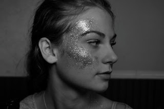
For my acrylic lift, I wanted to combine photographs from my favourite unit so far in the course to create something that was more than just a single picture. I took the following three photos using a Nikon D3100 with an aperture of f8 and a shutter speed of 1/60s, from the Studio Lighting unit and photoshopped them together.


When I completed this, I realized that this acrylic lift would be perfect for creating a marketable item; because of the glittering faces, I could make something related to makeup. I attached the acrylic lift to a ceramic container, put some makeup brushes in it and voila! A makeup brush container. I thought that the fact that the girl's face was so natural with that dusting of glitter on her cheeks, it was perfect to incorporate with something related to makeup, which gives women that little boost of colour or definition and gives them an extra hint of confidence. I was very satisfied with the finished product because I think it is unique and turns a plain white container into a much more interesting item that could be successfully marketed to women of all ages. 


Tuesday, 6 December 2011

Breaking the Rules

When you've constantly been reminded about taking into consideration rule of thirds, balance, line, and other rules of composition when taking photos, and suddenly you are given an assignment where you are expected to do the complete opposite, things get a bit difficult. Especially when the photograph still has to have good lighting and focus, making other aspects of it bad proves to be extremely challenging. In order to take these bad/good pictures, I realized I would have to look through my lens, find something I would take a picture of if I were trying to make it good, then move the lens or some of the objects to break the rules.
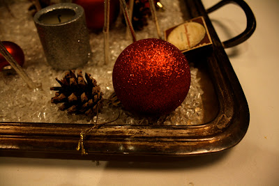


This photograph breaks the rules, "Line" and "Balance". The lines are very awkward and obscured by the busy background and jumble of different objects in the picture, and do everything but add visual unity. There is no balance in the photograph either, as the shapes of the different objects do not compliment each other at all. However, if the picture had been of only the red ball and the pinecone, it would be an example of asymmetrical balance.
Canon Rebel XS, shutter speed: 1/50, aperture: 3.5 


This photograph breaks the rule of "Simplicity". There are too many different shaped objects in the picture, which offset each other and confuse the centre of interest. The background is complicated and the main "centre of interest", if it can even be justified as that, is right in the centre, which lessens the dynamic of the image. 
Canon Rebel XS, shutter speed: 1/60, aperture 3.5


This photograph breaks the "Rule of Thirds" and "Line" rules of composition. Rule of Thirds is broken because the centre of interest (the red ball) is not placed on any of the imaginary lines. Instead, it is placed in a very weird position at the bottom of the picture. The composition of lines is also incorrect because they do not lead to the centre of interest and the mixture of straight and curved lines are misleading. 
Canon Rebel XS, shutter speed: 1/6, aperture 4.5